Library signage design
The University of Arizona Libraries
UX researcher/ UX designer
2025
Introduction
Effective signage plays an important role in helping people navigate and engage with a space, but this was a significant challenge at the University of Arizona Libraries. The original wayfinding signs which were designed during the early stages of the library’s construction, were functional but limited. Over time, new signs were added. These signs were inconsistent and incomplete as they were added by different people and departments over time. This project was an opportunity to rethink and redesign the signage to make it more cohesive, clear and helpful for everyone using the library.
Understanding the Problem Through User Research
We began our research with moderated usability testing sessions to evaluate how the signs work within the library space. Our primary questions focused on wayfinding methods and how participants locate information about collections and their physical locations. This test served as an assessment of the combined effectiveness of the library’s website and physical signage in supporting discoverability.
Participants
Our participant group included six individuals with varying levels of familiarity with the library:
New Users: Two participants who were unfamiliar with the library and its systems.
Somewhat Familiar Users: Two participants who had completed certain tasks in the library before and were curious to explore further.
Experienced Users: Two participants, including one library science major, who were very familiar with the library’s layout and systems.
We chose this diverse group to compare how different familiarity levels impacted the methods used, challenges faced, and interactions with library resources.
Process
Each participant was tasked with locating an item from the collections we aimed to promote within a 15-minute time limit. They were allowed to use the library website, online resources, signage, and maps but were not permitted to ask for assistance at the information desk.
Participants were instructed to think aloud, sharing their thought processes and decisions as they worked through the task. This approach provided valuable insights into their navigation strategies and the obstacles they encountered.
Outcomes
The testing revealed several key insights:
Signage Issues: Participants highlighted specific areas in the library where signage was unclear or inadequate, affecting their ability to navigate the space.
Impact of Titles and Signs: Observations showed how the wording and placement of signs influenced navigation patterns.
Online Resources: Maps, help pages, and the library website were valuable tools for participants who relied on them, though they required prior knowledge to access effectively.
Participants indicated they would not have been aware of certain collections without being prompted by the task. This confirmed our hypothesis that the collections require better promotion on the website and through physical signage.
Engaging Users Through Interactive Feedback
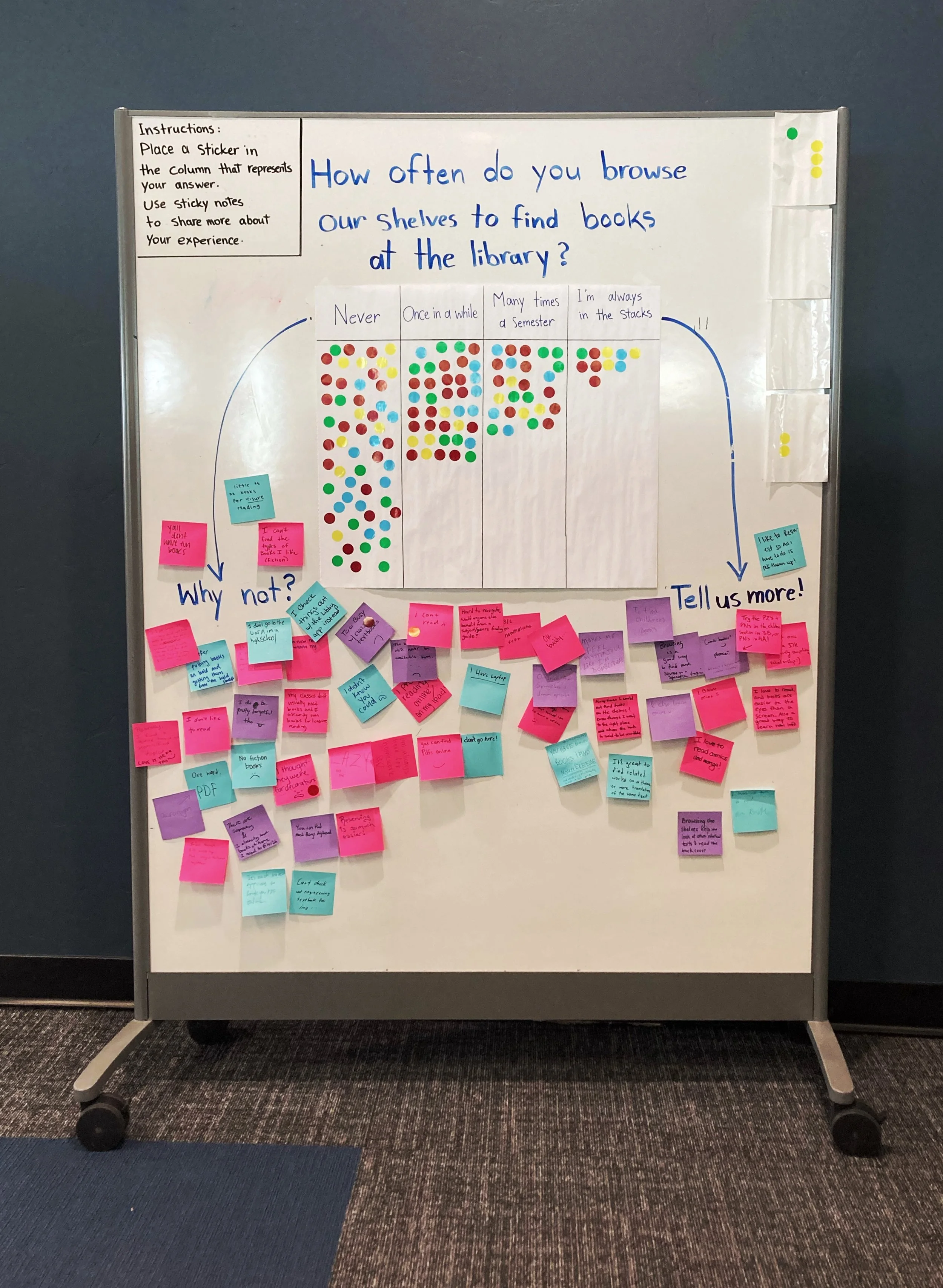
Our design team at the University of Arizona Libraries uses whiteboards as a joyful and interactive way to gather feedback from students on different topics. These "Talk-Back" boards offer a great opportunity for us to gather insights and better understand student experiences related to library services. The boards are usually placed in the library lobby and feature one or more prompts. The prompts invite students to contribute and write their thoughts using stickers, markers, and sticky notes.
For this particular project, we designed a Talk-Back board to explore how often students engage with our library shelves and whether they find them easy to navigate. We provided a table with different frequency options, and students placed stickers under the choices that best reflected how often they explored and used the library stacks.
They were also encouraged to write additional comments on sticky notes to explain their answers. The results were insightful and revealed that students were more likely to explore the shelves than we had initially expected. The board remained in the lobby for a week, and the feedback was carefully documented for future reference and decision-making.
This board also highlighted some barriers that prevent students from exploring the stacks, despite their interest. Factors such as a lack of clear information and signage about the contents of each section, as well as uninviting shelf areas, were among the reasons mentioned. These findings are important in helping us create a more inviting and informative library environment.
A detailed description of this Talk-Back board can be found in the research repository on User interactions with library stacks.
Issues with the existing Signs
After conducting the test, I started documenting and categorizing all the signs in the library. This process helped us identify the types of information provided throughout the space and find out about the current problems:
Lack of clear instructions in certain areas.
Lack of clarity in some titles and terms.
Inconsistency and varying formats in presenting the same type of information.
Lack of awareness about digital resources.
Insufficient knowledge and empathy toward users and their needs.
The documentation also raised several important questions:
Are all the necessary pieces of information included, or are there additional details we should consider adding to the signs?
Do all the signs target the same audience, or are there different target audiences for each sign category?
How are the physical signs and information provided on the library’s website work in terms of one another?

The table presents different categories of signs and the information currently provided in the library. For images and more details, please visit: Library Sign Categories.
Sketches
After gathering all the necessary information, I began making some sketches with the details that needed to be included in the signs. In this step, I only focused on book shelves. For the design, I used the University of Arizona’s font and brand colors to align with the established university guidelines. Details about the colors and typography can be found on University of Arizona's Brand Story page .

The factors we considered when selecting sketches and refining existing ones were:
Ease of Use: These signs will require frequent updates, so it is important that library staff can update the information easily, without significant effort or high expenses. Also. we needed to make sure that updating the signs would not affect their consistency.
Accessibility: The previous signs were not accessible. It was difficult for individuals with visual impairments or those using wheelchairs to read and navigate. To improve accessibility, I followed ADA standards for signage. The font sizes in my sketches needed to be changed to meet visibility requirements. I needed to make sure that they are large enough to be easily read from a distance. Color contrast was another factor to consider. using high-contrast combinations, such as dark text on a light background, to make the signs more visible to people with visual impairments. Some sketches didn’t meet this requirement.
The placement of the signs: We needed to make sure that they are mounted at an optimal height between 48 and 60 inches. This would allow both standing and seated individuals to read the information easily.
Prototypes
This project came with several constraints, especially around printing resources, paper size, and the ability to make frequent updates. Because of that, our team focused on keeping the design as simple and functional as possible.
The final prototype was intentionally minimal, mostly black and white, to stay within those limits while still communicating clearly. Each aisle in the library had two letter-sized signs, one on each end, featuring the relevant call numbers and subject areas. We also included a QR code that linked directly to a webpage we created, which walks users through how to read and use call numbers.


Usability Testing
To test the usability and functionality of our new sign designs, we conducted a usability testing by asking library patrons to use our collection sign prototypes to locate books in the library.
Our goal in this study was to evaluate the clarity and usefulness of the information presented on the signs. We wanted to see if the new information provided on the signs, such as the subjects and the QR code, was helpful for browsing and finding library materials.
We had student participants with no background in library or shelving work experience, as well as shelving staff.
Each participant was asked to complete the following five tasks:
Find any book in French literature (topic/subject)
Find any book written by Balzac (author)
Find any book about special education, which means education of people with special needs (topic/subject)
Find a book with the call number LC 3969 S7 1986 (call number)
Find a book called Young Teachers and Reluctant Learners (title)
The tasks were accompanied by a short interview with different questions for shelving and non-shelving students.
What we found
The new signage design improves the experience for both shelving staff and student users.
The improved visibility and placement help draw attention to the information, and the inclusion of topics or subjects increases patrons’ confidence when locating materials.
While the subject labels on the signs were helpful, the Library of Congress classification system is not understandable for all users. Including more subject-level guidance can help bridge this gap.
Although some students remember learning about call numbers in school, this knowledge is often not retained or applied in practice.
The QR code on the signage was less effective than expected. Users did not find the linked page helpful.
Aisle numbers should not be removed from the signs. They are important for helping users build a mental map of the space, remember locations, and navigate more easily.
Revised design:
The test results helped us refine the design. I realized that including more information about collection labels was more important than we initially thought, and I needed to do my best to preserve that information as much as possible. The placement of the QR codes and the pages they were linking to was incorrect, so I updated both. I created a template that includes different types of information, avoids unused white space, and maintains consistency over time. I developed three templates for different use cases and tested them on the shelves, including edge cases with the longest collection labels and call numbers, to make sure they work. Each template comes with a very simple instruction sheet for the staff responsible for updating signs. The project is currently in the implementation phase, with final testing and approvals underway.

Template 1

Template 2

Template 3